February 29, 2020Comments are off for this post.

Brand Identity: How To Find A Professional Designer

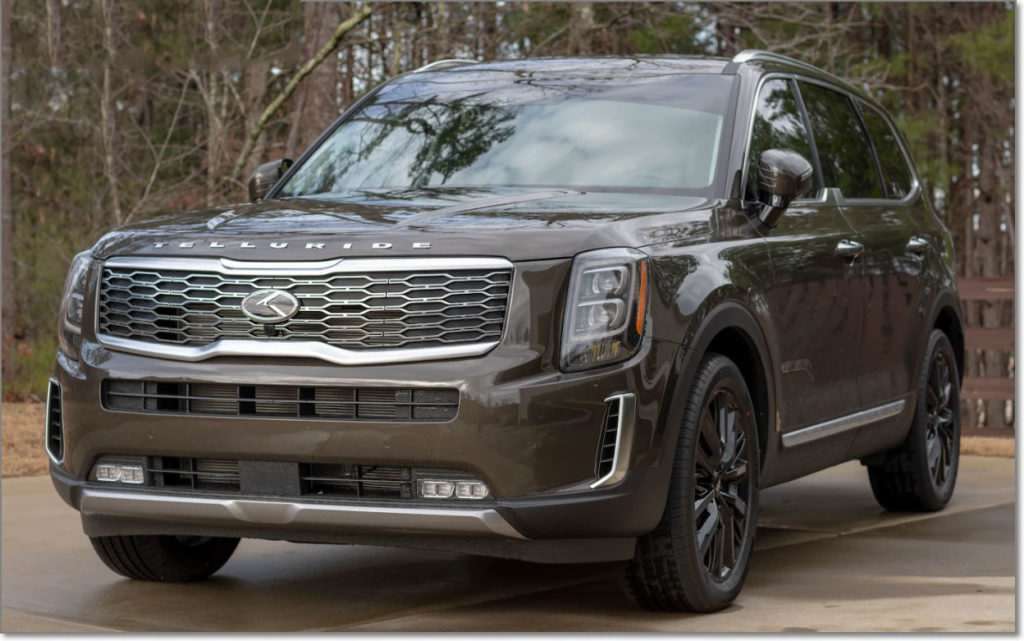
A blank business card - represents your brand identity before you create it.
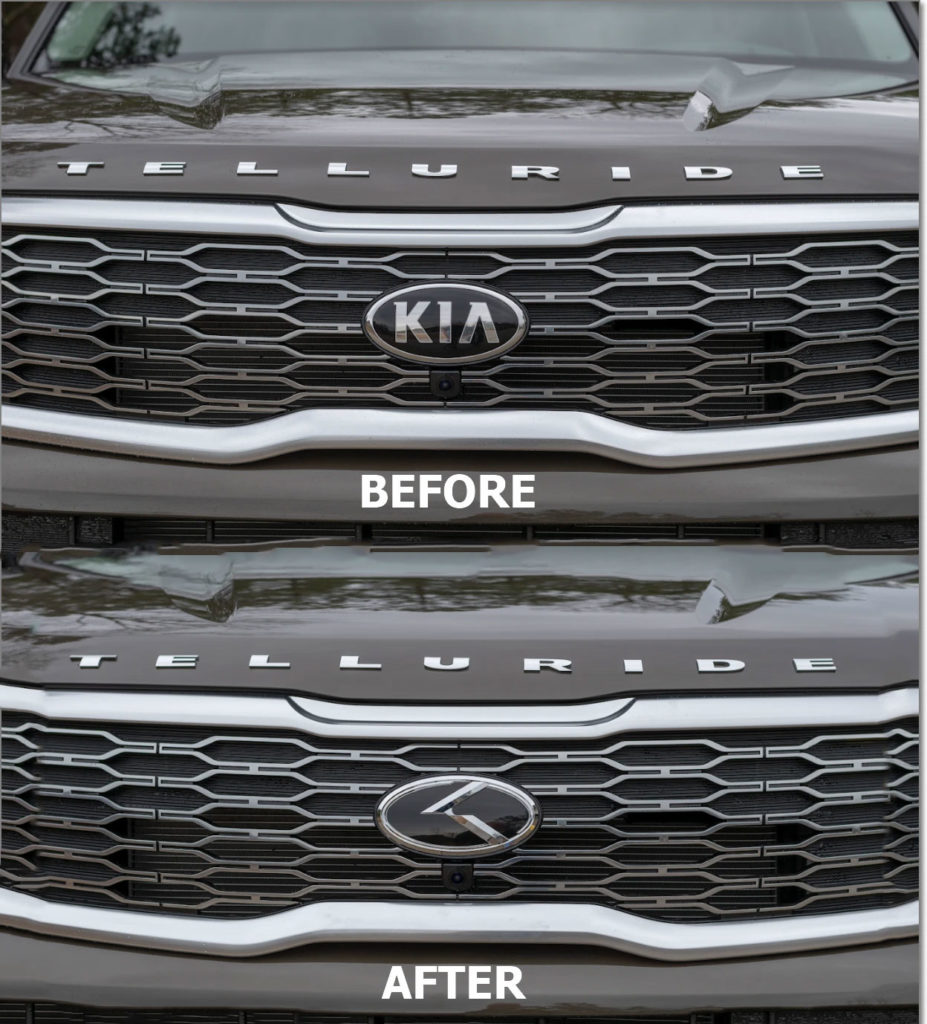
Your Business Before Proper Branding

A professionally crafted refresh can add real value to your brand identity.

Your logo is the visual representation of your business. It might be the first thing a potential customer sees when they look you up. You don't want it to say the wrong thing. You never get a second chance to make a first impression, and in today's hyper-competitive market, a first impression might be the only one you ever get to make.

A professionally designed logo is an essential part of your businesses' overall brand identity. It can project trust and confidence or give the impression that you're inexperienced and under-equipped. A compelling logo design might be what tips the balance in your favor when someone is picking between you and a competitor. Even industry veterans with great word-of-mouth referrals can benefit from a brand refresh. 

A professional designer tasked with refreshing your brand identity can bring your business to the next level.

A Quality Logo Is An Investment

A good designer spends years in school learning the tools of her trade and logs thousands of hours doing client work. With that wealth of experience comes a higher fee. 

As a professional yourself, you understand the value of hard-earned knowledge. It takes years in school and on the job to be able to accurately assess a situation, diagnose a problem, and fix it. Your experience is what sets you apart from others in your field. 

Unless you won the lottery, the kind of logo designer you use is constrained by what you can afford. That's why many small to medium-sized businesses turn to freelance talent markets like CrowdSpring or 99designs. While you can connect with millions of freelance designers quickly in these global design bazaars, not all designers are equal. It takes a lot of time to research these designers. But browsing individual portfolios, checking customer reviews, and reaching out directly so you can get a feel for how they work is time well spent.

With perseverance you can find a quality freelancer - be warned, there are some pretty bad logos out there, and you don't want your brand on that list. A Madison Avenue budget isn't a prerequisite for a good logo. But you shouldn't skimp on what you're willing to pay either. Think of your new logo as an investment rather than an expense — it's worth budgeting for the best logo designer you can afford. 

What does a good designer look like? 

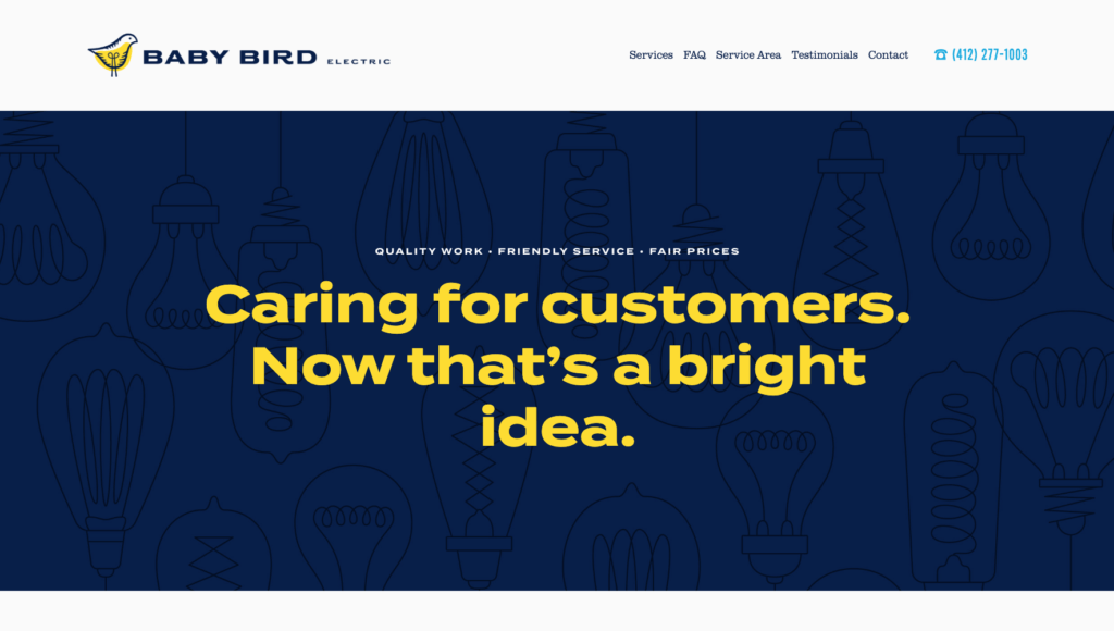
We reached out to Jim Hargreaves, an AIGA award-winning designer and founder of the Pittsburgh based design studio Hampton Hargreaves. We were impressed with his firms' complete visual overhaul of Baby Bird Electric — a residential and commercial electrical wiring and repair business. 

The electrical contracting business is very competitive in Pittsburgh. Baby Bird opened its doors in 2017. Because they were new entrants, the original logo had a scrappier look. But as the business matured, it became necessary to update the look and the need for a new logo - and brand identity became apparent. 

What started as an initial chat about developing a new logo grew into a conversation on the benefits of a complete rebranding; new logo, new website, new vinyl wrapping on vans, and new sales collateral. It was a significant undertaking, but, like so many things greater than the sum of their parts, as the process unfolded, tangible results were soon revealed. Baby Bird always did quality work, that never changed, but the image certainly did. And customers, new and old, took notice.

babybird electric homepage image

What makes this story even better is that these two local businesses saw an opportunity to work out a trade for services. Hampton Hargreaves traded a full image makeover for a complete office electrical makeover.

That bespoke logo, typeface, and color palette evoking industry titans Westinghouse/General Electric (with a pinch of Saul Bass-esque design flair) would generally have cost around $5,000 - $7,500. 

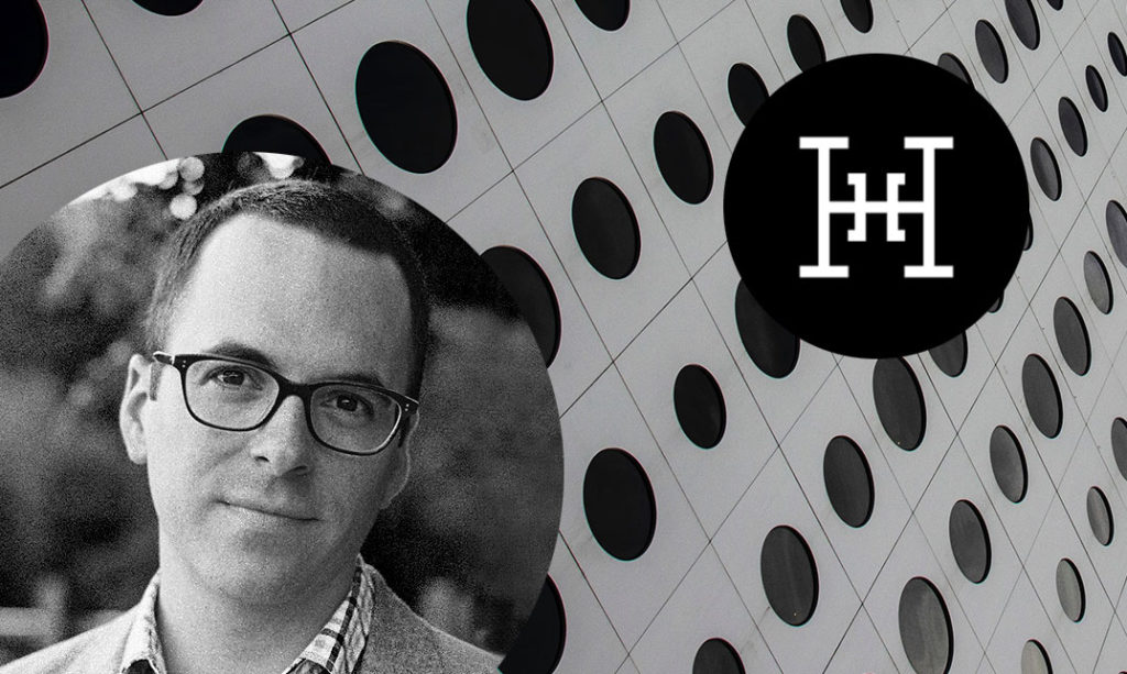
Jim Hargreaves of Hampton Hargreaves

Interview:

Jeremy:  First of all, thank you in advance. It means a lot for you to take the time out of your schedule to share your insights. Just have to say, I love what you did with Baby Bird Electric. 

 Jim: Thanks for the kind words. Baby Bird was an atypical project since we worked out a trade for services.

Jeremy: I figured as much, and that kind of synergy won't be present every time a customer reaches out for design work. It was pretty special that you were able to do that. But, as you said,  that situation was unique, and to save money, a lot of contractors might look at crowdsourced design sites. What are your thoughts on using those services?

Jim: Crowdsourced design services are inherently flawed, especially if you utilize the "contest" method. Why? You're essentially asking someone to put forth good work and good ideas, with no guarantee of compensation. Ask yourself, how much effort would you put into a job if you knew your chances of getting paid are slim to none? Probably not much.

Jeremy: The price difference can be pretty dramatic, though. What do you say to someone who says, “Why would I pay so much more if I can get the same thing way cheaper?" 

Jim: Good design solutions require time. Many hours can be spent before the design phase even begins — learning about what the client needs and what their audience wants. Crowdsourced design services don't allow for that type of commitment. And lastly, the results, in general, tend to be very generic and unrefined. There are more bad logos than good on these types of sites.

Jeremy: Quality work — no matter what industry or trade — can be hard to find. Where would you suggest small or medium sized businesses go to find quality designers — the kind that can take their business to the next level brand wise?

Jim: Higher quality designers with the right credentials and education tend to gather on higher quality networks. Look for designers who belong to the American Institute of Graphic Arts (AIGA), or try sites like Behance, Dribbble, and The Dieline. It always helps to stay local as well. Look for design studios in your area and evaluate their portfolios. If you like their work from a visual standpoint, the next step is to contact them and ask them about their process and how they develop a project proposal.

Jeremy: It's hard to beat face to face - especially with another local business owner. OK, let's say all goes well; you find a local designer or an AIGA affiliated one, and you're ready to begin. What can a client do to make the designer’s job easier?

Jim: Let an expert be an expert. All too often, customers reach out to a professional looking for guidance in areas where they lack knowledge; but because design is often personal, once the project gets underway, customers often start to ask for changes or revisions based on whims or anecdotal evidence. Work to develop a solid brief, and then trust your designer to deliver. If I knew everything about electricity, I wouldn't hire an electrician. The same goes for design. Let them do what they do best.

Jeremy: Thanks again for the insight Jim, we appreciate your time. 

Jim: Cheers, and thanks for reaching out.

Think About Your Business Goals

Your new logo or brand design should start with YOU. Take some time and think about it. What do you want your logo to say about you and your business? What kinds of things would you want your customers to associate with your logo? 

You don't have to go off to a retreat somewhere to "find your inner logo," but you likely have a few companies and brands you admire. Start there. Does a particular shade of orange appeal to you? Does a typeface evoke dependability? What matters is that you gather your thoughts because eventually, you'll be reaching out to individual designers.

No matter what route you take, remember your business deserves a quality professional logo.  It can really solidify your brand identity.

Sometimes you know what you want, and sometimes you aren't quite sure how to express what you've got in your mind. There's going to be a conversation and negotiation with your designer. Take time and realize that you will have to come up with an appropriate budget. You know your financial situation best, but when it comes time to give your business a look it deserves, it makes sense to sit down with a professional. Finding a trustworthy designer who you like and with a body of work that resonates with you is hard - but like all hard things, worth it in the end.


Hampton Hargreaves

https://www.hhargreaves.com/

Founded 2015 by Jim Hargreaves

Hampton Hargreaves is a design studio specializing in brand identity, packaging and collateral for beer, wine, spirits, food and retail goods. Founded with a singular mission: stylish and intelligent design for extraordinary people, HH helps brands achieve real results through simple means. 

Email: jim@hhargreaves.com

Tel: 412.467.6827

https://www.hhargreaves.com/

June 9, 2019Comments are off for this post.

Women’s Shelter Domestic Violence Poster Concept

Original Poster

I recently saw this post on the r/Pittsburgh subreddit about the multi-lingual support that the Women's Center & Shelter of Greater Pittsburgh offers to victims of domestic violence.

The top comment noted that non-English speakers might not be able to understand the service being offered.

I addressed this concern by changing the focus from the list of languages to an image meant to resonate with someone who might need the service. I accomplished this by using a stylized image of a woman in pain who was being silenced.

Concept for domestic violence program for Pittsburgh Women's Shelter.  Features stylized crying figure and eight languages
Domestic Violence? We Can Help

I then repeated the phrase "We Can Help" in all the languages offered. Even if one does not understand the small amount of English used, my thinking is that the imagery indicates subject matter and phrase repetition would indicate to the reader that multiple languages are spoken at the phone number provided.

Detail of poster

Please note that the female image is just a vector stock image and is not attributable to me. This poster is for conceptual purpose only.

May 31, 2017Comments are off for this post.

Small Ways To Build Your Brand: Thoughtful Packaging

joy complex thoughtful packagingThere are a lot of budget friendly ways to build your brand. Thoughtful packaging - notice that I didn't say "custom" packaging - is one very simple and effective way to help people remember you.  

A small business just getting off the ground has to use money wisely.  It's great to aspire to have awesome custom boxes that are foil stamped with your logo and contain an enclosure that unfolds like a flower petal opening in the sun to reveal your amazing product.  However, that kind of packaging flourish costs a lot of money.

Thoughtful packaging doesn't take a lot of money.  All it takes is some thought and creativity to craft a nice experience for your customer while staying within your budget. The materials you use don't have to be fancy or expensive and any freebies you provide don't have to be luxurious.  What you're looking to elicit is a smile.  If the packaging and presentation makes your customer smile they're primed to feel positive about your product (you know the thing they actually spent money on).  They'll remember that little moment. I know I do and that's why I package my products with giving people a smile in mind.

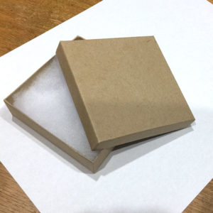
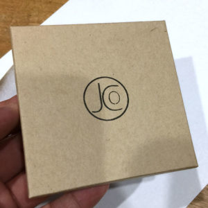
For most of my small jewelry I use inexpensive natural brown kraft boxes that  you can get at any craft store.  If you want to buy them in bulk definitely check out Amazon - they have them there for ¢33 a box if you buy 100. 

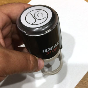
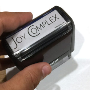
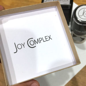
I purchased two self inking rubber stamps  from Zazzle to brand the boxes.  I put my stylized logo on the outside and then when my customer opens the box they also see the full text logo on the inside.  I also add small note inside the box so that my customers see that an actual person has prepared their order and wants them to be happy with their purchase.

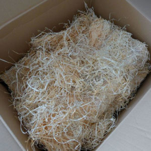
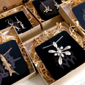
Kimberly Falk of Ontogenie uses a similar box but goes even further to thoughtfully brand them as her own. Not only are the lids stamped but in keeping with her naturalist theme she uses a wood shaving fill to carefully protect her creations.

Furthermore she has a variety of cards to which her jewelry is affixed. This lovely presentation of her work shows her customers how much thought Kimberly puts into every one of her items - from design to the packaging every aspect of her work is special.

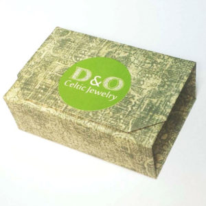
Finally check out this creative box by designer Daniel M. Floey Jr. of D & O Celtic Jewelry.

D&O box

For his smaller jewelry pieces he uses origami boxes that he hand makes with craft paper.  Each box is truly unique and since he uses craft paper with different patterns on it his boxes can change depending on the season and the holiday! Now if that's not thoughtful packaging, I don't know what is.

What examples have you see of thoughtful packaging that has impressed or inspired you?

 J O Y C O M P L E X / Copyright MMXIV-MMXXII / Privacy PolicyTerms & Conditions