Last weekend, I lived inside of an Apple product launch : from conception, to launch, sales, and end-of-life.
The product? Apple Card Covers. 500 "premium cellulose fiber" Apple Card Covers sold in a weekend. My thoughts on the media hype beast that made this project possible and what it might mean.
Why I Made My Apple Product: Background
Back in March 2019, Apple announced that it would launch a new type of credit card - one tightly integrated with its wallet app and Apple Pay which also offered new levels of simplicity and privacy.
Apple also announced a companion card that you could use if a vendor didn’t accept ApplePay. It looked really cool, as far as physical credit cards go. White and gray with a laser-etched Apple logo on the front and no number or signature on the back. Oh, and the card itself? Milled from titanium.
Want to jump down the rabbit hole into the design aspects of the Apple Card? Arun Venkatesan goes into intricate detail on his blog post, The Design of Apple’s Credit Card. Here’s an excerpt.
As is expected from Apple, the card is unlike any other. At a close glance, the minutest details set it apart from the rest . . . This level of obsession with the details is nearly expected from Apple.
Arun Venkatesan
Let’s just say people lauded Apple’s phenomenal attention to detail for the design of this card.
Until they didn’t.
Apple Card Launch
On Tuesday, August 20th, Apple Card launched for all US consumers. I applied for a card and got one in short order.
The whole experience was smooth. The application process was simple, opting out of the arbitration clause - that “the internet” said you should do - was super easy (via text message no less), and receiving Apple Card via FedEx and then activating it via the proximity sensor embedded in the packaging was really slick.
And the titanium card did look cool. I never intended to really use it. It would mostly just sit on my desk. Some people did use it, and posted photos of it dirty.
A couple days later, people also noticed a particular line of text on the Apple Card support page warning that, “some fabrics, like leather and denim, might cause permanent discoloration that will not wash off.”
The damage wouldn’t stop the card from working; just some cosmetic disfigurement. Like many Apple snafu’s, perceived or warranted, this one blew up on the internet quickly.
The only piece I read that called out this click-centric tempest in a teapot coverage was by Zach Epstein for BGR titled: Please, for the love of God, shut up about the Apple Card getting ruined by leather and denim. He pointed out that worn looking credit cards were not something new and gave reasons why.
About the only thing that was new was the fact that Apple pointed out that credit cards suffer wear (and provided instructions on how to avoid or mitigate Apple Card from suffering the same fate).
If Apple hadn’t said anything, nobody would have reported anything. Yes, it is sort of amusing that a card held up to such “exacting design standards” was just as likely to get damaged by the things that damage your run of the mill payment card. But it's sort of akin to poking fun at the child who points out that “The Emperor has no clothes on.”
I wasn’t really paying attention to the stories and then on Friday the 23rd, even my Dad emailed me about it.
Subject: should have used plastic, with a link to a CNN article on the “fiasco.”
I emailed him back, “Everyone loves to poke fun at Apple. They should just get those paper gift card sleeves and emboss them with their logo - and sell them for $10.99. They can run a print advert with this text underneath: April Fools seven months early."
Then I decided why not do it myself?
I launch MY Apple Card Cover
Step 01: The Cover
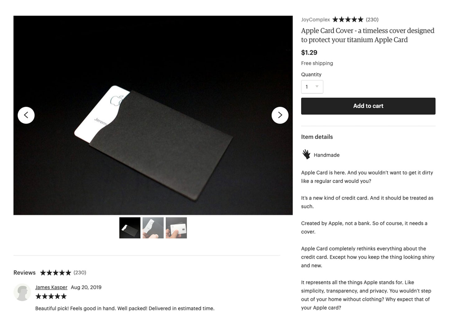
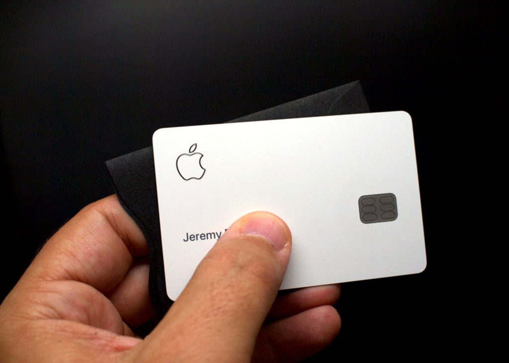
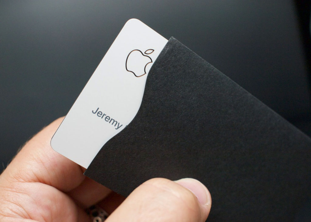
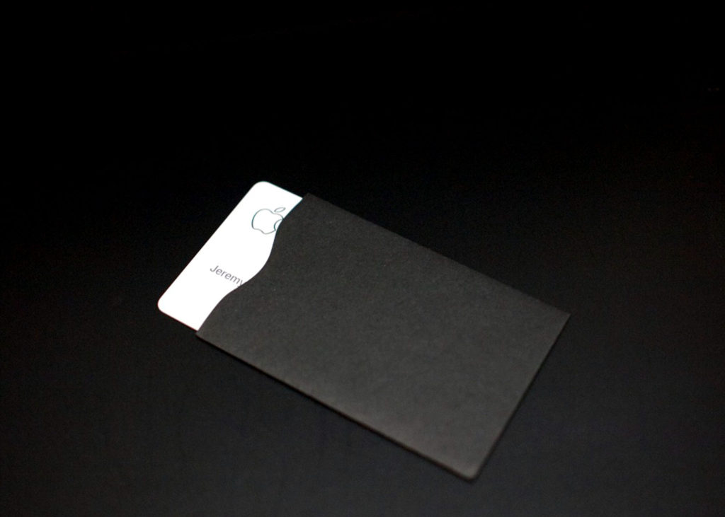
I picked up a gift card cover and did a quick photoshoot at home with my Apple Card.
Step 02: The Description
This step is the most fun for me. How would I describe my Apple Card cover? How would Apple describe a cover they designed? They’d use Apple-speak. And so would I.
I took the first statement Apple made about the card on their website and added some tongue in cheek, self-aware, yet earnest additions.
| APPLE | ME |
| Apple card is here. | And you wouldn’t want to get it dirty like a regular card would you? |
| It’s a new kind of credit card. | And it should be treated as such. |
| Created by Apple, not a bank. | So of course, it needs a cover. |
| Apple Card completely rethinks everything about the credit card. | Except how you keep the thing looking shiny and new. |
| It represents all the things Apple stands for. Like simplicity, transparency, and privacy. | You wouldn’t step out of your home without clothing? Why expect that of your Apple Card? |
And then I channeled my inner Jonny Ive and came up with some ad copy.
That’s why we sourced these premium cellulose fiber sleeves. They come only in black thus ensuring the best Apple Card spending experience during each and every use.
Don't be surprised if you find yourself suppressing a slight gasp as you marvel at the striking contrast of the pristine arctic white laser-etched Apple Card juxtaposed with the matte black sleeve.
And then I concluded with a bit of marketing that Steve would have gotten behind:
For the price of a song.
Add to my Etsy store in the “Fun Things” category, alongside my Jeff Goldblum belt buckle.
Step 3: Get It Out There
I posted a few links to my Apple Card cover on Reddit. I was not expecting to sell any of these covers, just have some fun.
I chose r/Apple (for obvious reasons), r/humor (again, for obvious reasons), and r/CreditCards (where at least one person appreciated my satirical product and gilded the post silver).
I watched my Google Analytics light up as people visited my Etsy Listing.
No sales. And then after about twenty minutes . . . I sold one. Then an hour passed. A sale. Then another and another. What was going on?
None of my Reddit posts were upvoted - 3 of the 4 posted were at zero, the lowest a Reddit past can be. I eventually saw that a site I hadn’t posted on had referred several visitors to my listing.
My cover had caught the eye of someone at a tech blog. They posted a story about the cover and the sales started coming. My iPhone notifications were going crazy and they didn’t stop throughout the night and the next day.
Step 4: Figure Out What To Do
I was going to have to deliver card covers to people. I had a source. But how much money was I going to be making? After Etsy fees (¢20 per renewed listing + a sales fee), shipping (¢50 via USPS), envelopes/labels, and time spent folding and mailing . . . I’d be lucky to make $80.
This wasn’t a viable business. The time spent folding plus fees killed any profits. I take pride in the kind of service I typically give my customers. For example, I usually write a personal note thanking them for their purchase. But that was out of the question with the volume of sales I experienced. I couldn’t keep up.
Furthermore, this was a classic arbitrage situation, I was sourcing these covers for a low price and selling them at a higher price, but it wouldn’t last long. Copycats who were better positioned to actually make a profit were sure to pop up eventually.
So, I decided to cap the total I would sell at 500 covers - with a caveat, or ten.
Step 5: Have Fun - Special Editions
I held back 10 covers so that when I sold out, which I did Saturday afternoon, I could re-list nine of those covers as belonging to a group of the “Last 10.” I added special edition text to the listing:
LAST 10 APPLE CARD COVERS WE WILL EVER SELL
Once they are gone they are gone forever. Will they become sought after pieces of Apple memorabilia? We don’t know.
All we do know is that these are the LAST TEN IN THE WORLD
Protect YOUR Apple Card with this rare and highly sought after cover (over 490 sold to date).
Purchase Includes:
- Apple Card Sleeve (matte black)
- Authentic Apple Sticker (One Per Cover)
- Certificate of Authenticity (Signed)
- Upgraded Shipping (1st Class w/Tracking)
Accept no substitutes.
I priced them at $10.
And you know what? They sold. All nine were gone by that evening.
That left the final one. Cover Nº500. The last of the covers. The most special one.
THIS IS THE LAST REMAINING APPLE CARD COVER AVAILABLE FOR PURCHASE
There are NO OTHERS like it.
WE ARE OUT OF STOCK AND ARE UNABLE TO OBTAIN MORE
You Will NEVER Find Another One Because We Are Not Selling Any More
This is the LAST of its KIND
Purchase Includes:
- Apple Card Sleeve (matte black)
- Authentic Apple Sticker (TWO)
- Certificate of Authenticity (Signed)
- Exclusive “Collector” Packaging (Special Edition)
- Upgraded Shipping (Priority Mail w/tracking and Insurance)
Accept no substitutes.
I priced it at $100.
I went to bed and woke up to a notification on my phone saying it sold as well.
I had one cover left. The prototype cover. The original that inspired this journey.
There’s a rich history of people acquiring and selling prototype Apple products. I was going to piggyback on that history.
BEYOND RARE - Prototype Apple Card Cover
Before the SOLD OUT AND NEVER TO BE STOCKED AGAIN 500 Apple Card Covers there was Ur-Cover
Following in a line of prototype products, for sale is the prototype Apple Card Cover that birthed the 500 that SOLD OUT right here not long ago.
This ULTRA MEGA RARE find may not have been designed in the Cupertino design lab alongside the likes of the prototype Mac SE or the Indigo iBook G3 prototype (both pictured). But it was the FIRST COVER CONCEIVED as a cover FOR a product that was designed by someone in Cupertino.
This Alpha prototype of the popular Apple Card cover is the ULTIMATE COLLECTOR’S DREAM if your dream as a collector is to own the prototype cover that spawned over 500 successful Apple Card Covers which you can no longer purchase from here.
ONE and ONLY one - Like Neo from The Matrix
Purchase Includes
- The One and Only PROTOTYPE Apple Card Cover (matte black)
- Authentic Apple Sticker (TWO)
- Certificate of Authenticity and Provenance (Signed)
- Exclusive Prototype “Collector” Packaging (MEGA Special Edition)
- POLISHING CLOTH (Black, of course)
- Upgraded Shipping (Priority Mail w/tracking and Insurance)
Accept no substitutes.
I priced it at $1,000.
It hasn’t sold. But you never know.
I see it as a monument to my weekend glimpse into Apple product silliness.
Conclusion
I never intended to have this window into the Apple product lifecycle. But it happened. Immediate takeaways?
- I should have priced the covers higher, but then I couldn’t have marketed them for the “price of a song.”
- Being at the right place, at the right time, with the right skills, and most importantly getting lucky that a tech site picked up on this was key.
- Maybe Apple should have shipped the darn thing with a cover - or solved the credit card wear issue and used gorilla glass or something.
- Mailing out 500 Apple Card covers is exhausting. It's not hard work but it's not something you'd want to do for an extended period.
The fact that I sold 500 card covers in a weekend shows that there's a need, a perceived one at least, for a product to protect your Apple Card. This need was driven by media coverage that blew all notion of proportionality out out of the water.
A scuff on a charge card is not a grave consequence. But coverage of scuffs on an Apple Card became a "thing" on the internet. I don't fault the people who spent $1.29 on a paper cover because of all this reporting. (I think the folks who spent more were having a good time and have more disposable income than I do. )
The media over-reported this but in the quest for relevant content and clicks, they sort of have to report on these sort of things. What's the solution? Take a step back? Adopt a "slow news" mentality? I don't know, but I'lll certainly be pondering this conundrum more thanks to this little art project.
