


Synopsis: How I made a steampunk cover for my Apple Watch. It was designed using Rhino & Zbrush and manufactured in copper by i.materialise.
After completing the Ironclad Apple Watch cover I posted photos about it online. One place I posted to was Reddit, a news aggregation, web content rating, and discussion website - basically a big community discussion board separated by interests. Posting personal creations on Reddit is always an experience. Reactions can range from incredibly nice to just as incredibly savage. You quickly learn to build a thicker skin.
A portion of the criticism on Reddit can be described as trolling - attacks meant to be hurtful - and though some trolls are pretty funny you learn to ignore the assholes and get on with your life. But it's not all trolling. In fact you get a lot of nice comments; and it’s really gratifying to get compliments from strangers throughout the world.
But it’s also helpful to receive honest, even if it’s harsh, criticism from people who appreciate the work put into something but explain why they don’t like it. I take that criticism to heart because it causes me to reevaluate my work by seeing it through new eyes.
Sometimes a person will say something and their observation is so obvious that I ask "why didn't I think of that in the first place?!" The answer is that sometimes you get caught up in a design that you lose sight of the bigger design picture. Other times the critique is more subjective and I won't change it because it's a choice I stand by no matter the criticism.
One comment on Reddit about the Ironclad Apple Watch cover stuck with me:
Riveted Iron is not the same as steampunk.
That term gets way overused online, it's almost lost all meaning 🙁
This critic was right. But in my defense, I thought that not too many people would immediately know what “ironclad” meant. But if I used “steampunk style” as a catch all, people clicking on the link who were unaware of ironclad ships would have an notion of what to expect since they probably had some idea of what "steampunk" meant. I guess it’s sort of like cheese-food in relation to real cheese; it’s similar but not the really same.
I decided to fix that and go full on steampunk.
Copper: A Steampunk Staple
I previously worked with bronze and silver for the Ironclad covers but for that true Steampunk aesthetic this cover had to be copper. I've been trying to get something made in copper ever since i.materialise started offering it as a material. Copper is a beautiful metal that gains character through use and is lustrous when polished so I really wanted to work with it. The problems I had were either related to money (too expensive to justify) or design (I kept getting rejected for one reason or another). With this project I knew I had a good candidate for something affordable and castable.
I wouldn’t have to do too much redesigning because I had the unadorned base model from the ironclad cover. This was sort of accurate. I didn’t have to do much but what I did do was very fiddly and I don’t know if it would have been easier to just start from scratch like I did with the 38mm cover or do what I did and just play around with the model I already had.
Everything worked out but the real big thing that I had to do before remodeling was to get ideas about how I wanted this thing to look! Steampunk items look very high tech in an old tech way. I did some google image searches for 19th century steam boilers and electrical transformers of the same era (along with dynamos, turbines, etc).
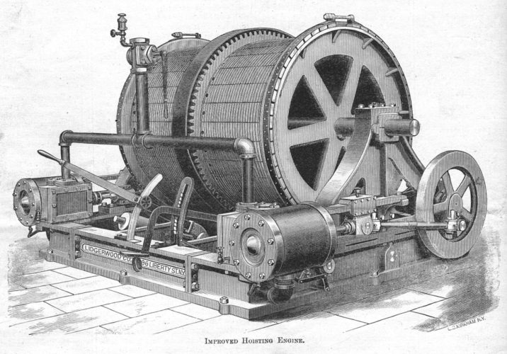
This old engine picture inspired several parts of the Steampunk cover.
Since the Apple Watch obviously runs on electricity this cover was going to have to look like it used a boiler of some kind to convert steam to reciprocating motion to generate electricity to power the watch. Given the real estate available, I decided to compartmentalize things. Each side of the watch would serve a different purpose that when operating in concert would make the "Apple Watch Machine" work.
Since one side had the digital crown and a button I decided that would be the control area of "the machine”. The bottom quarter would house steam fittings, the left quarter would be the gears and a connecting rod, and the top quarter and bezel would have electrical related things. And the whole case itself would be the boiler.
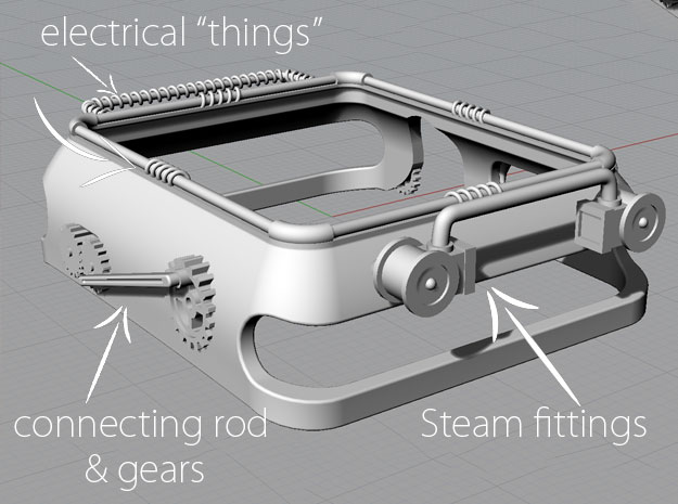
The cover pre-sculpt with the various parts highlighted. The "Control Panel" can't be seen from this angle unfortunately.
Once I decided on a design it was just a matter of making neat little pieces that would fit on the watch and meet the design specifications for wax printing and then copper casting. Oh, and sculpting the little extras that I prefer to do in ZBrush rather than in Rhinoceros.
Waiting, Receiving, and Patinating
I knew that this cover would fit my watch so once I was happy with the overall design all I had to do was upload it to i.materialise and wait. One of many nice things about i.materialize is that they won’t just cancel your order if it’s something that has some potential manufacturing issues. After their engineers complete their manual review of the model, they will contact you and explain the potential problems, and ask if you want to proceed.
I mention that because I did in fact receive an email wherein they explained that some of the details on the design were a bit too fine and would probably be lost during production. Since I knew I would be doing further surface treatments I told them to go ahead and produce the cover. It’s nice from a customer point-of-view that i.materialize just doesn’t cancel an order outright but give the designer opportunity to correct the issues identified
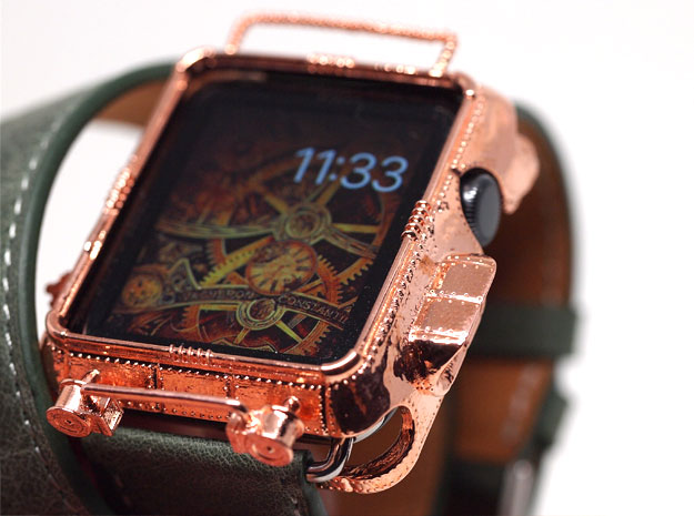
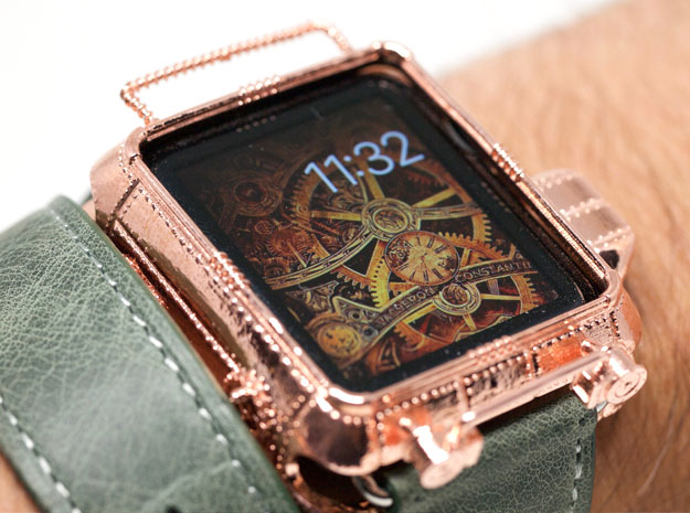
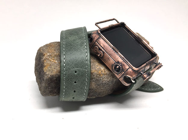
Now it was just a matter of waiting for the case to be made and shipped to me. Copper is usually done in 10 days so I had at least that much time to go look for an appropriate band to go with the cover. I didn’t want another cuff design like last time but it did have to be leather. I saw a photo of the Apple Watch Hermès with the double tour band and thought something like that would look amazing with the copper cover. I went on Amazon and did a search for double tour bands. I really liked this green leather one I found on Amazon Handmade; but I also happened upon this other green leather band that came with a cuff in case I wanted to go that route and a second shorter band. Even better, I got it used! It arrived in a few days and looked even better than the photos. I was getting excited to see how it would pair with the cover.
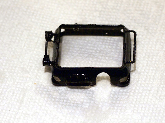
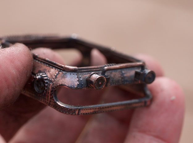
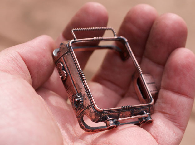
I got an email letting me know that the cover was shipped and should arrive from Belgium in a couple days. When UPS drove up I pretty much ran out to door to get the package and ran back inside to open it up. I was really pleased with what I saw. Here are some photos of the cover straight from the box.
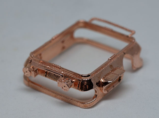
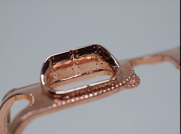
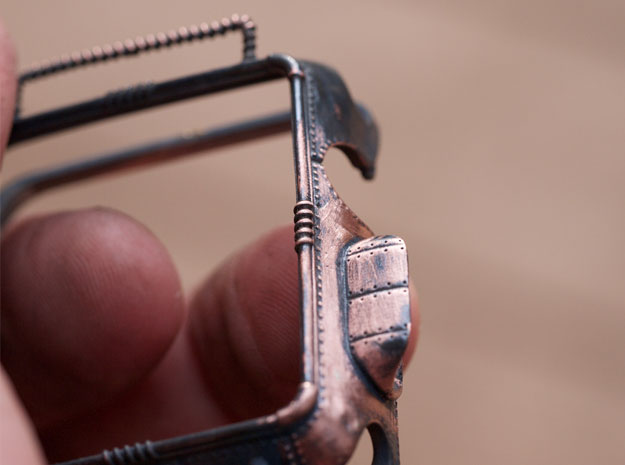
It was beautiful and nearly perfect, but sadly the connecting rod on the left side of the cover didn’t survive the manufacturing process. But I had been warned that some parts might not make it, so I wasn’t complaining, since every other detail looked perfect. I especially liked how the little “control hood” over the button came out – it’s my favorite part of the cover.


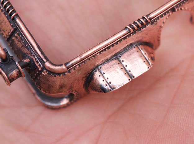
I liked the bright and shiny appearance, but now I had to decide if I actually wanted to go through with giving the cover a surface treatment. I waited a few days then said “What the hell” and dumped it in a solution of liver of sulphur and hot water. The surface changed pretty much instantaneously from shiny coppery orange to a matte charcoal black. There was no going back now.
-
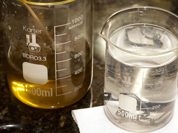
- Liver of sulphur on the left and baking soda solution on the right.
-
- Cover with black oxidation
-
- Drying and cleaning the oxidized cover
-
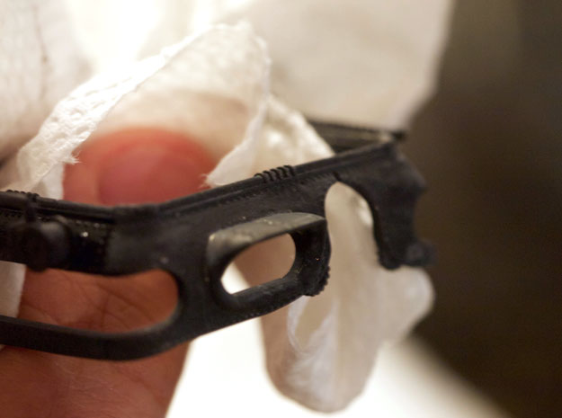
- First pass with a dremel bit.
-
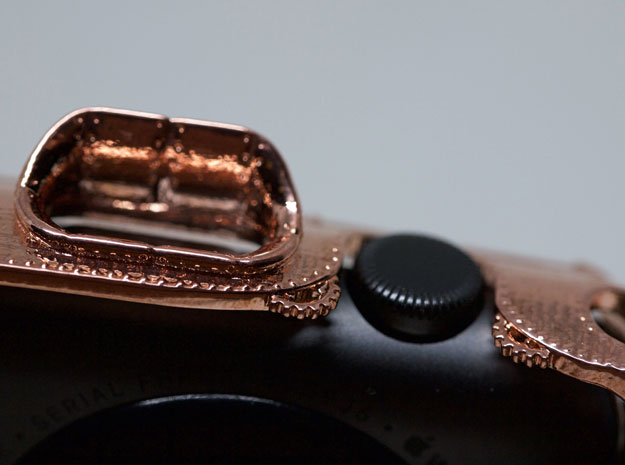
- The control hood after some dremel work. Notice the recessed lines and indentations.
-
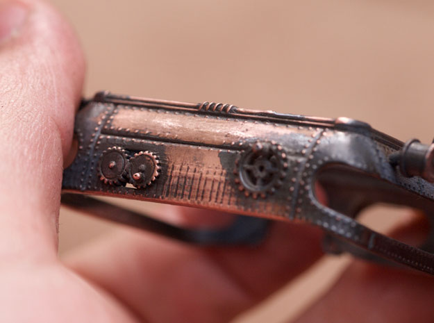
- Carefully working on the steam fittings
-
- I love how this part came out.
-
- Cleaning and sealing with renaissance wax
-
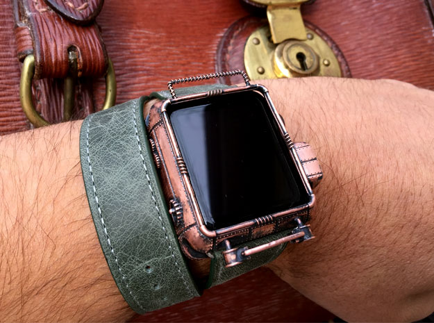
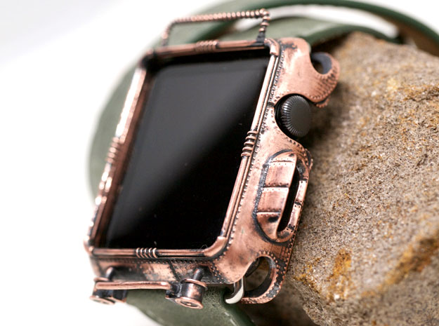
- The finished product.
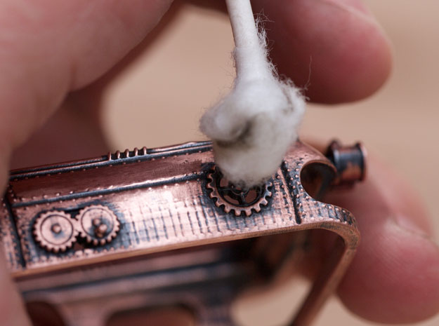
Now the cover required some careful Dremel work. The steam fittings and the “electric wires” on the bottom and top would be very susceptible to damage, so I had to be careful. This part of the process took a good bit of time. I switched bits frequently depending on if I wanted scratches, high polish, or something in between. It had to look beat up but also cared for, like a real piece of machinery at a manufacturing plant.

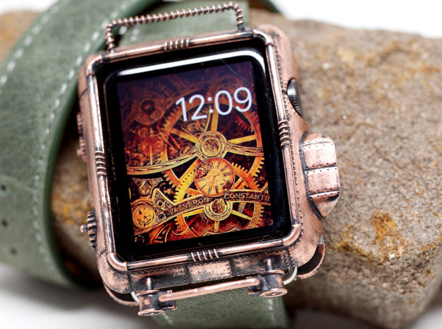
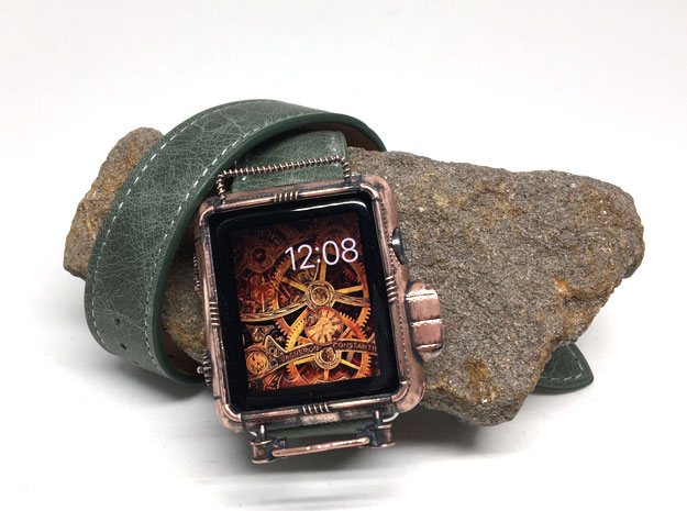
When I was happy with the look, I applied some Renaissance Wax to protect the patina. You can see the results above.
In the end I do like the patina more than the polished copper; but I really like how that polished copper looked as well. It would be nice to have both on hand to do a side by side comparison.
I believe this cover can definitely be called “steampunk” without reservation. If you want one for yourself, it can be purchased on my Etsy store.

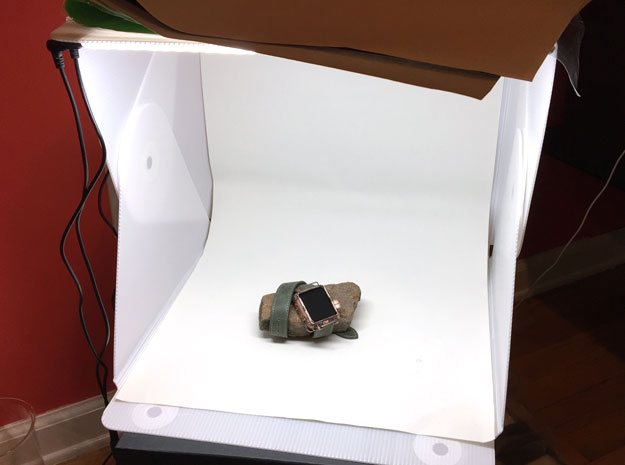
Note on the photos: I use an Olympus E-PL1 camera and an Olympus 60 mm macro lens. All the photos are taken using a Foldio 2 as a lightbox.
If you find yourself needing to take lots of pictures of small things it’s invaluable to have around. The Foldio 2 is great because it’s bigger than the Foldio 1 (which I had been using) and it has two LED light strips that plug into the wall (the first one had one strip and it ran off a 9 volt battery). It makes it super easy to take photos in a neutral environment which makes color correction in Photoshop a snap.
No Comments.
Comments are closed.